First I found this map about U.S. network connectivity. The map includes most of the fiber wire backbone of the country:
 |
| Connectivity Map Source |
The map shows the fiber wire routes of most of the major carriers in the United States. It uses a different color for each major provider and uses point to represent the endpoints of the fiber connections.
I found this map very interesting because it demonstrates the prevalence of fiber connections in the modern age. Only a decade ago, there was nearly no fiber wire in use in the United States, but this map demonstrates how wide spread it has become. It also demonstrates how quickly a map can become confusing when there is a lot of information. Each route is colored based on the carrier, and with 26 carriers, the map becomes crowded with colors and lines.
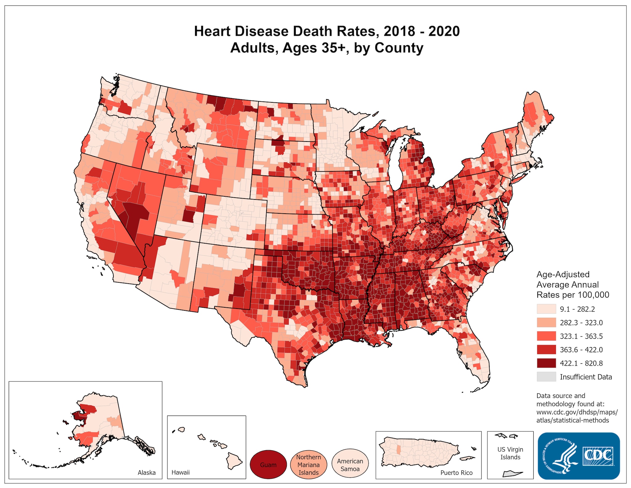
The next map set I found related to heart disease in the United States. I actually used a population map in order to examine some possible associations between population and heart disease.
 |
| http://www.mapofusa.net/us-population-density-map.htm |
 | ||
| http://www.cdc.gov/dhdsp/maps/national_maps/hd_all.htm |
Both of these maps use a very similar design. The first map displays population density, with a darker red color indicating more population in that county. Similarly, the second map displays heart diseases rates of adults over the age of 35, with darker red indicating a higher concentration of heart diseases deaths. Both uses outlines to indicate states and split statistics into counties.
I found this interesting because I would expect heart disease deaths to be highly associated with population; I expected there to be a high rate of heart disease wherever there was high population. It is interesting to notice how heart disease occurs more often in the Southern States in the Eastern United States, despite relatively similar population densities in this region.
The next map I examined was a global map of oil consumption, organized by country:
 |
| http://www.ritholtz.com/blog/2010/06/oil-consumption-around-the-world/ |
This map depicts oil consumption information in terms of thousands of barrels consumed daily. Consumption amounts are displayed for countries and regions, within different sized circles that correspond to the amount of oil consumption. In addition, the color of the circles corresponds to the continent they are located on.
I thought this map was very interesting because of the design they chose to display the information. They place the circles approximately where the country or region would be located on a real world map, but they do not include the usual physical boundaries. The colors help to organize the circles into regions, making it easier to find the information you are looking for. The circles work very well because they indicate the amount of oil consumption by size, so it is visually easy to compare the consumption of different countries.
No comments:
Post a Comment