Thursday, February 28, 2013

Assignment 7: Census Maps

I created three population maps this week from census data from 2000.  I decided to try out different map layouts to see how each looked.
 
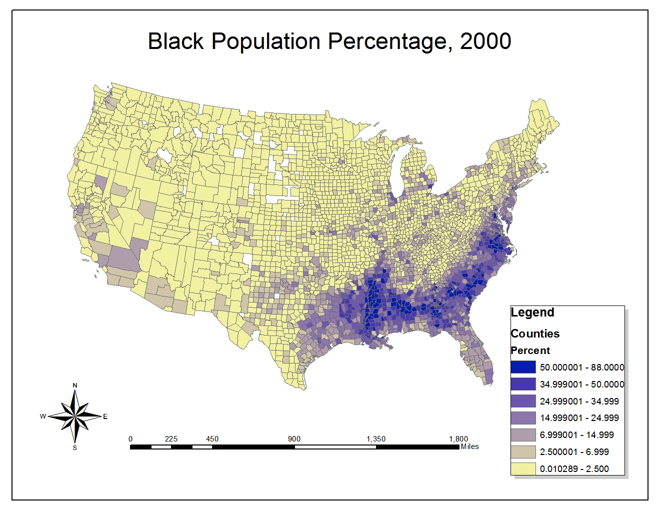
The Black population map in the United States can be seen above.  The Black population is clearly the largest in the Southeast.  This comes from pre-Civil War era where the high concentration of African slaves was in the South working on plantations.  Much of these Black populations did not migrate far, and so have remained in the Southeastern United States in high percentages.  There is also a higher percentage of Black population in California, known for being more diverse and generally have higher minority percentages.  Also it is interesting to note that in more recent years, the black population growth rate for the black population "surpasses U.S. average" according to an article in the Business Journals, an online news site.
 The Asian population is very heavily represented on either coast, at most often urban centers.  The west coast is particularly dense because the ports in the West are were many Asian immigrants arrived.  These populations often arrive in the United States from this direction and have been migrating out from these areas since.  It is also noteworthy that the highest percent population was around 46%, indicating that there are not any particular counties that have an incredibly high percentage of Asians.  Likewise, in the whole country, it can be seen that the percentage of Asian population is rather low in most states not located on the West Coast.  It is interesting to note that the Asian populations in the last ten years has grown considerably, tending to very between 40-80% growth every year, according to an article written based on the 2010 census.

 Other races distribution can be seen heavily influenced by the Hispanic populations.  It can easily be seen that all of the states bordering Mexico have the highest percentages of other races.  This is most likely immigrants from Mexico, Central America and South America that are arriving in the border states such as Texas and California.  This is why these counties have the highest percentage.  In the North, a small amount of immigrants that come through Canada can be identified around the Washington area.  Also, most likely from Caribbeans, there are some higher concentrations seen in some parts of Florida.  Overall, the Mideast and Northeast have very tiny percentages.

This map series provides very interesting perspective on the percentage populations of different regions throughout the U.S.  In fact, a quick slideshow where the maps are aligned could quickly give an idea of the overall distribution of populations in the United States.  After reviewing the maps I created, I have concluded that I believe the third map is the most visually appealing.  The blue background and varied, but intense colors used as identifiers makes it stand out among the other two.  It is also important to note how effective at ArcGIS was at helping to create these maps.  Joining data from tables can be incredibly powerful, as there is a lot of data collected in table format not necessarily for maps, but with ArcGIS, they can be used to create maps by importing them and joining them to the geographical data we have already collected.

Reference:
1. "Growth rate for black populations", Thomas, Scott. Business Journals. <http://www.bizjournals.com/bizjournals/on-numbers/scott-thomas/2012/10/growth-rate-for-black-population.html?page=all>
2. Campbell Gibson; Kay Jung (September 2002). "Historical Census Statistics on Population Totals By Race, 1790 to 1990, and By Hispanic Origin, 1970 to 1990, For The United States, Regions, Divisions, and States". Population Division. United States Census Bureau. Retrieved 17 November 2012.

Thursday, February 21, 2013

Assignment 6: DEMs in ArcGIS


The spatial extent information for this map:
Top: 39.8291666661
Left: -105.788888889
Right: -104.969444445
Bottom: 39.3838888883

Spatial Reference: GCS_North_American_1983

Saturday, February 16, 2013

Assignment 5: Projections in ArcGIS

This week we examined different map projections in ArcGIS.  Six different projections can be seen below:


  Map projections are incredibly powerful and important when considering a map, especially when considering the world.  The larger an area a map covers, the more distortion there can be between the real world terrain and the map.  This is because the world is naturally curved, but a map is flat, so we must use projections to force the three dimensional terrain fit on to a flat surface.  Each projection brings different distortions about distances, areas and relative measurements we might make on the map.  It is important to know that each map projection will often have different measurements for distance, area and relative sizes, and each of these may be different from the real 3-d values.  This can clearly be seen by comparing the different values of measured differences from each map, the variation is very great and none of them represent the actual on surface distance between Kabul and Washington D.C..
  This becomes one of the greatest perils of map projections; the improper use or knowledge will easily lead to false measurements.  When comparing measurements about landmass or distance, it is easy without proper understanding of projections, to use the incorrect one.  This will lead to incorrect data that might lead to incorrect conclusions.  The major pitfall is that most of us use maps with an assumption of scale.  Although many maps use exaggeration, when we for instance view a world map, many often assume that all the proportions are to scale.  The Hammer projection is something that we are used to, but this projection doesn't preserve distances, but most would easily assume they can measure the distance between two cities based on this projection.  And although looking at the Mercator projection, it may almost seem obvious that the sizes are incorrect when viewing it with latitude and longitude, without these values and a slight squishing of the ends of the map, it becomes a very commonplace map.  This map is not accurate in size or distance and can easily give us a skewed view of comparisons. 
  Many of the projections feel unnatural because we don't see them often.  This can easily cause the average user problems because a map projection like azimuthal equidistant feels strange.  However it is maintaining relative distances, and really all map projections should feel strange because we are seeing all sides of a three dimensional object in a plane.  The map projections are almost by nature illogical because they cannot actually represent how the globe looks from any real world angle.  This can be seen with the Stereographic, when following the latitude lines, a much more accurate measurement of distance can be observed, but it also makes it very apparent that we are seeing both the top of the globe and bottom simultaneously, causing us additional natural confusion.
  These perils all however show how important using map projections correctly can be.  It demonstrates that using these projections correctly can be very powerful.  For example, if we disregard our initial odd feeling about sinusoidal, it gives us such a more accurate picture of how to compare how wide Antarctica is compared to Africa.  The distance between parallel meridians is preserved, and normally it is very hard to determine these distances accurately.  But now in this projection we can get a much more accurate picture, it reveals a lot about the usual map projections we use and how distorted they are.  Viewing a map that covers a large area in different projections reveals much more information and accuracy than viewing it in a single projection.  Map projections can help reveal the truth about the geography of these areas.

Thursday, February 7, 2013

Assignment 4: Introducing ArcMap

The ArcMap tutorial produced a poster about proposed airport expansion.


I found the ArcMap tutorial very interesting.  The process of going through all these tools really revealed how powerful a GIS system can be.  I thought there were many points where I could see many additional uses for the functionality we were learning.  For example, the population density that was retrieved from a table and joined based on ID was extremely powerful.  It made showing very numerical and hard to visualize data on a map incredibly easy because the computer would map the colors and pair the correct population values with each region.  This long tutorial also made me appreciate the complexity and challenge of such an advanced GIS system.

This GIS system had incredible functionality and many uses.  GIS is able to make a strong translation between data and visuals.  This is incredibly important as it is hard for many of us to comprehend purely data driven presentations such as tables and calculations.  A map or visualization of data is often critical to our understanding and ArcMap really helps make this possible.  GIS can transform powerful data sets and months of research into a presentable form.  The maps created out of these GIS systems are incredibly diverse, as the tools are rich and complex.  A map can be made for any purpose with the ubiquity of GIS.

The drawback is complexity with GIS systems.  Even through several hours of tutorial, it can be easily seen that this amount of complex creation of maps is time consuming.  The users of GIS that understand it completely must still work for many hours to produce a final result.  This is a major improvement over old mapping techniques however, where the many hours would still result in discrepancies between data and the final map.  Here at least, GIS keeps track of the data carefully, and the resulting map will always be drawn according to the data you desire.

Overall, I feel GIS systems are extremely powerful and beneficial.  The power of computing is becoming increasingly important in the modern age, and I think GIS is a crucial step in harnessing that power to visualize and show data.  More and more data is becoming available as we integrate computers into our everyday lives.  With this quantity of information, it is important to have tools like GIS that can decode, display and quantify it.  The incredible power of GIS is that so much computation can be done through computers, leaving us to think about the higher abstract concepts and ramifications of results rather than having to focus solely on computation and analysis.  I think GIS is the only way forward in a data heavy world.