


This becomes one of the greatest perils of map projections; the improper use or knowledge will easily lead to false measurements. When comparing measurements about landmass or distance, it is easy without proper understanding of projections, to use the incorrect one. This will lead to incorrect data that might lead to incorrect conclusions. The major pitfall is that most of us use maps with an assumption of scale. Although many maps use exaggeration, when we for instance view a world map, many often assume that all the proportions are to scale. The Hammer projection is something that we are used to, but this projection doesn't preserve distances, but most would easily assume they can measure the distance between two cities based on this projection. And although looking at the Mercator projection, it may almost seem obvious that the sizes are incorrect when viewing it with latitude and longitude, without these values and a slight squishing of the ends of the map, it becomes a very commonplace map. This map is not accurate in size or distance and can easily give us a skewed view of comparisons.
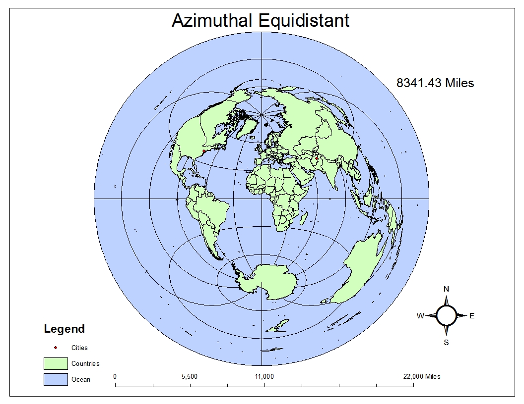
Many of the projections feel unnatural because we don't see them often. This can easily cause the average user problems because a map projection like azimuthal equidistant feels strange. However it is maintaining relative distances, and really all map projections should feel strange because we are seeing all sides of a three dimensional object in a plane. The map projections are almost by nature illogical because they cannot actually represent how the globe looks from any real world angle. This can be seen with the Stereographic, when following the latitude lines, a much more accurate measurement of distance can be observed, but it also makes it very apparent that we are seeing both the top of the globe and bottom simultaneously, causing us additional natural confusion.
These perils all however show how important using map projections correctly can be. It demonstrates that using these projections correctly can be very powerful. For example, if we disregard our initial odd feeling about sinusoidal, it gives us such a more accurate picture of how to compare how wide Antarctica is compared to Africa. The distance between parallel meridians is preserved, and normally it is very hard to determine these distances accurately. But now in this projection we can get a much more accurate picture, it reveals a lot about the usual map projections we use and how distorted they are. Viewing a map that covers a large area in different projections reveals much more information and accuracy than viewing it in a single projection. Map projections can help reveal the truth about the geography of these areas.
No comments:
Post a Comment